So we’ve been in our home about a year and half now. And although we have accomplished a lot, there are several projects sitting at about 80% completion. Our master bathroom is one of those spaces. All the “big stuff” per say is done but it is definitely lacking in the style department. And being an interior decorator you can imagine how this drives me crazy every single time I’m in there. I think we should first take a little walk down memory lane just to see how far we’ve come.
Here she is folks, in all her glory! Red tile and 80’s lighting aside, this bathroom was doomed from the get go. The shower was like a tiny closet covered in mold, the vanity was the perfect height for our 7 year old and then there was the smell <shivers>. The original plan was to wait on bathroom remodels for at least a few months to recoup the rest of the remodel. But after a few showers in the guest bathroom I knew that wasn’t going to work. You see the water pressure in the guest bath was like a fire hydrant shooting you directly in the chest! Because again…this house was designed for tiny humans. OUCH!!
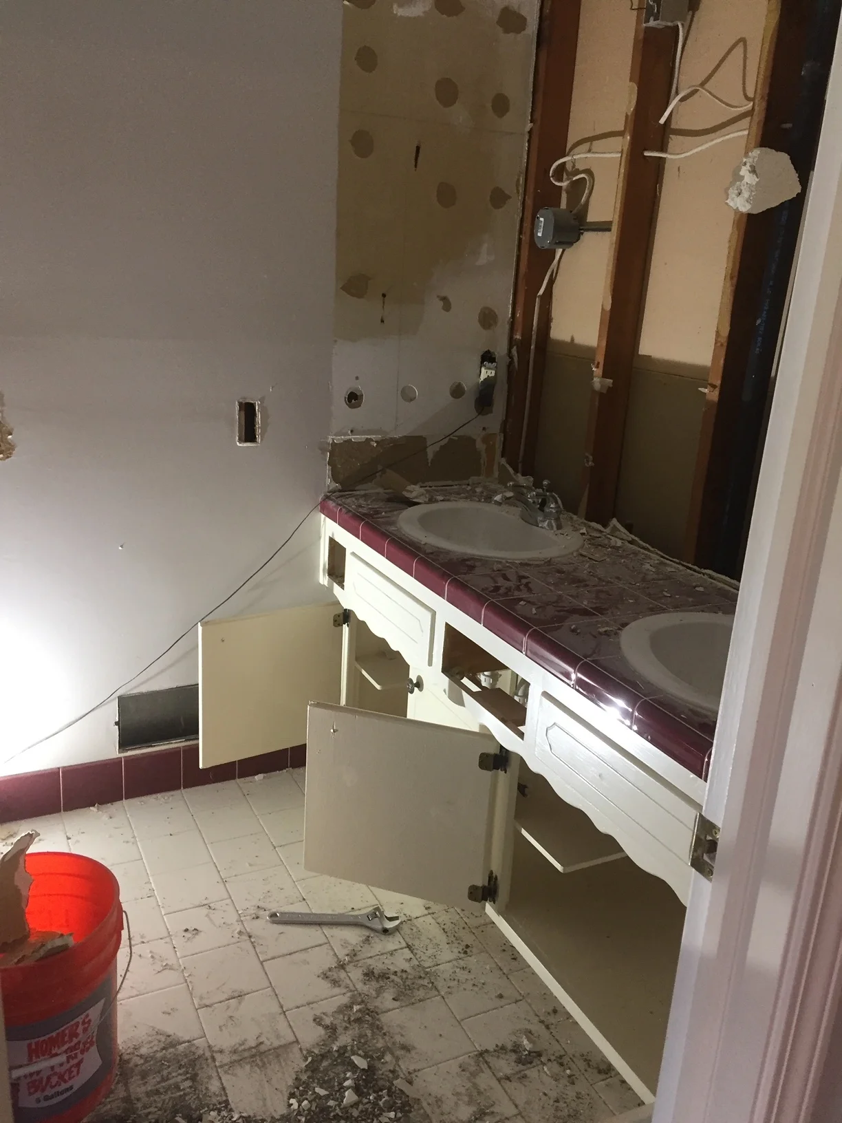
So one day while my hubby was hard at work in the kitchen I snuck in and did this…
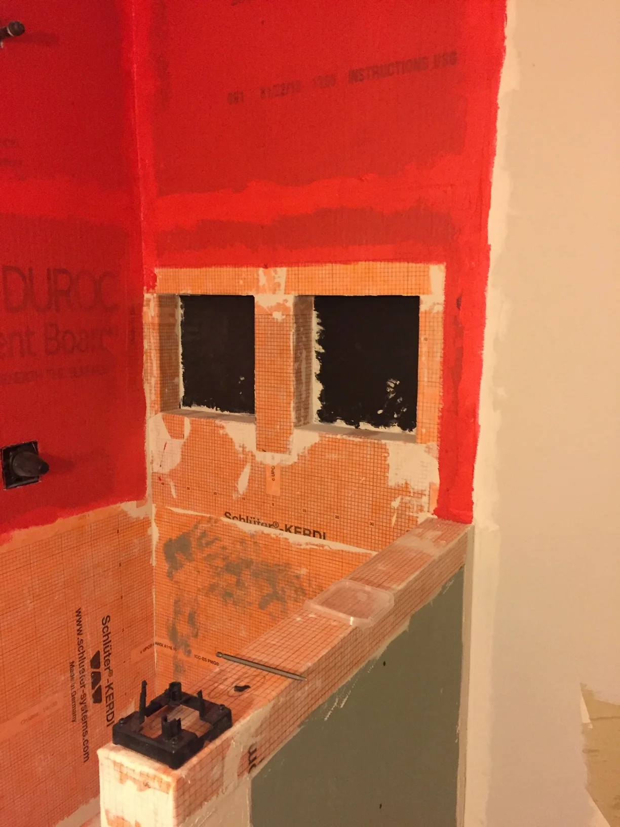
It didn’t take long for my husband to come running in to see what all the commotion was. He wasn’t happy, mostly because he knew that it meant more work and more money. I told him this would be my job and I’m proud to say I did about 80% of the demo in there. We ended up hiring a company to come frame out the new shower and make it water tight and they also did the shower floorpan. The shower was tiny and we wanted to make it as large as we possibly could so we hired a company to do custom glass for that also.
Here was the shower all prepped for tile and glass. That’s when we came back into the picture. We choose a marble hexagon tile for the floor and 3x11 white subway tile for the walls. My sweet husband tiled the floor and walls. We make a great team, I put down the mastic and he cuts and lays the tile.
We knew we wanted to do a custom built vanity in here because we really wanted to maximize the space since it’s a small bathroom. Profile Cabinet is a local company here in Kansas City, they did an amazing job! I showed them my vision and they made it happen. We choose to have them paint the vanity Agreeable Gray in Sherwin Williams. And the countertop is quartz product called Aurea Stone in Paragon. The brushed nickel pulls go perfectly with the soft gray.
We recently painted the walls in here La Paloma Gray by Sherwin Williams. Originally we painted them Alabaster in Sherwin Williams but it just wasn’t right for this space. You really do need some sort of natural light to be able to pull off white in my opinion. I choose these lights because like I said there are no windows and we needed to brighten up this joint! I will link the mirrors and lights below because you can’t really see them in these photo’s.
So now that the remodel is complete we are ready to “style it up”. This is my favorite part, it’s what really makes it’s feel like home. I plan to add warmth by incorporating woods and baskets. You know I’ll find a place for a plant, it’s amazing what some greenery can do for a space. Instantly brings a room to life! We are thinking a shelf above the toilet will be nice too. I’m also thinking I’d like to add some art above the towel holder. What do you guys think?
Stay tuned…I’ll be blogging about the reveal in a week or so. I’ve linked up all the items from the Design Board for you here. Thanks for following along!


